A newsroom that looks like it has one.
Nexbrief is a news and magazine HTML template built the way a publication actually works: dense front pages, real article layouts, and a design system you can re-skin in a single attribute. No framework, no build step, no jQuery.
Thirteen homepages. One stylesheet.
Every demo below is a plain HTML file using the same CSS and the same components. Switching layout is a copy-and-paste job, not a rebuild.
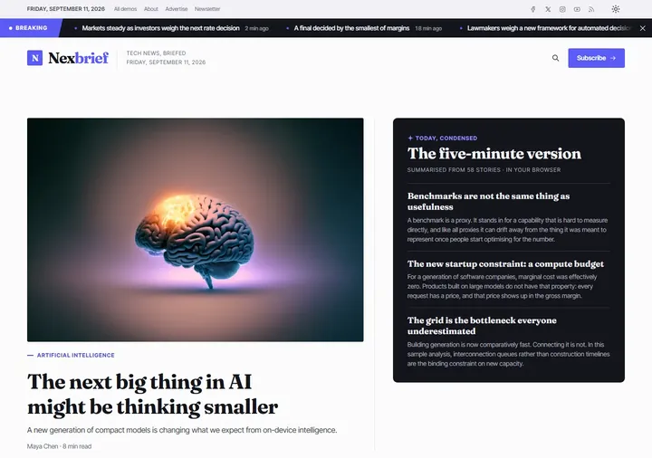
AI Newsroom
Summaries, audio, for-you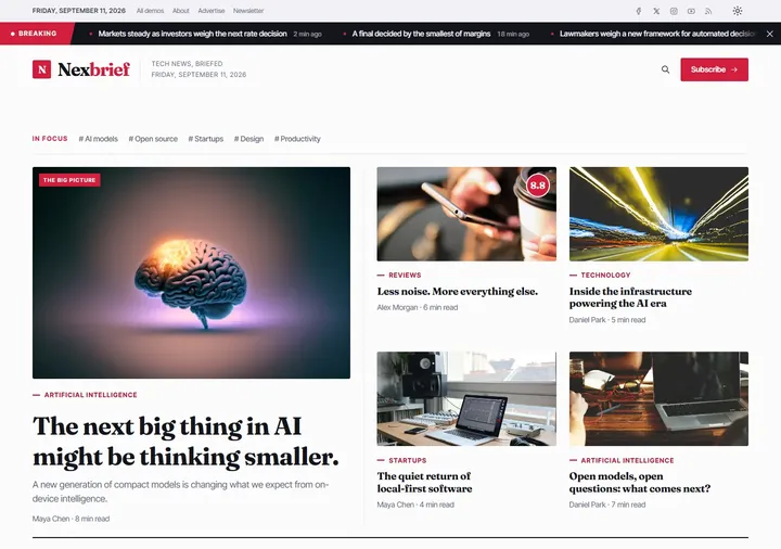
Grid
Classic news grid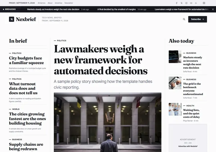
Newspaper
Broadsheet front page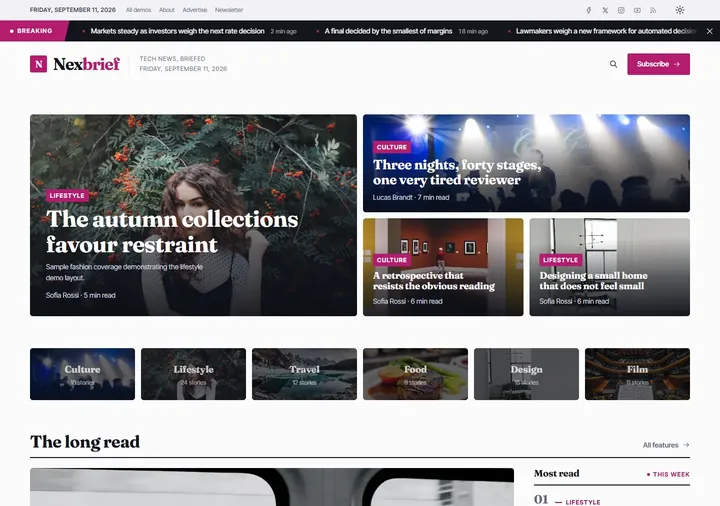
Magazine
Mosaic feature grid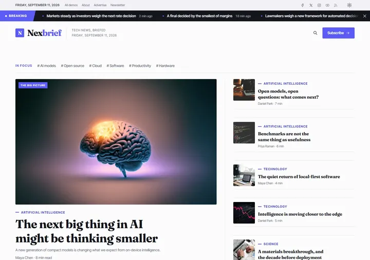
Tech
Gadgets and reviews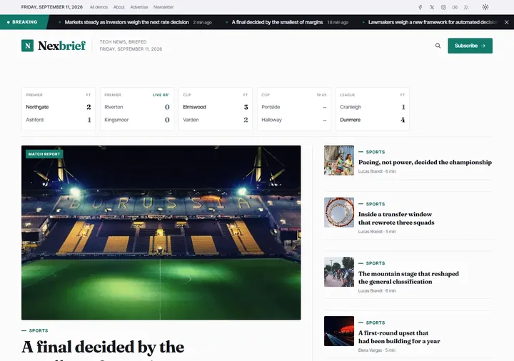
Sports
Scores and standings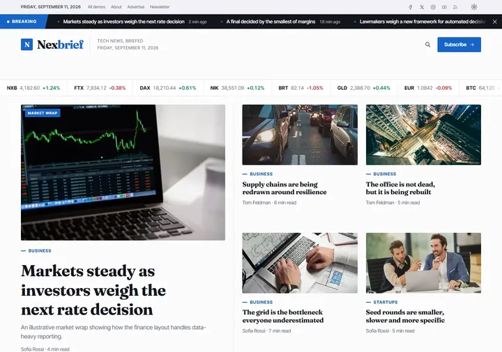
Business
Markets and finance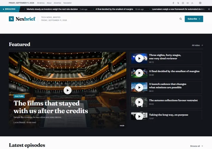
Video
Video and gallery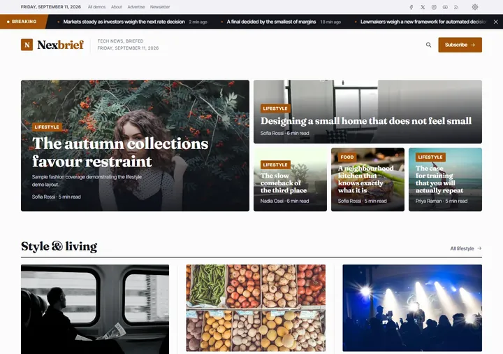
Lifestyle
Fashion and culture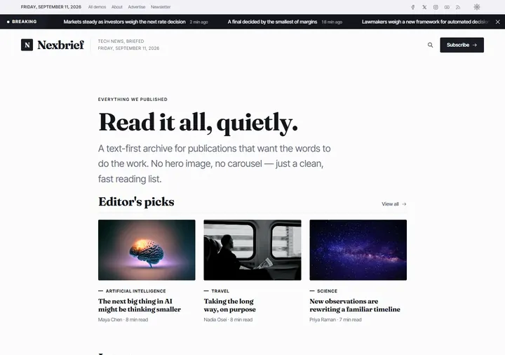
Minimal
Text-first blog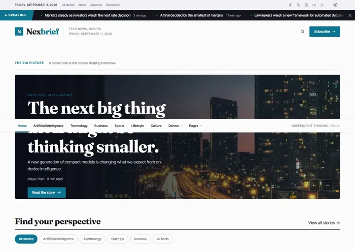
Slider
Full-width carousel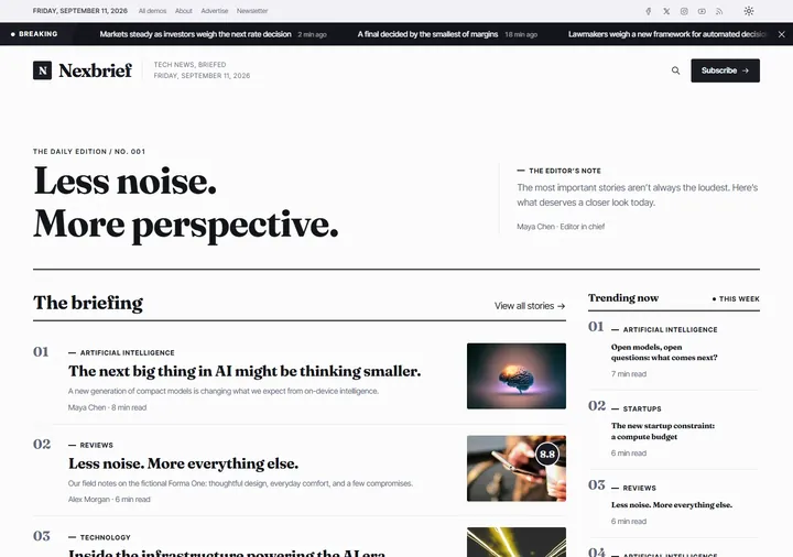
Editorial
Ranked story list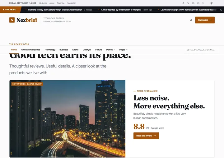
Review
Scored reviewsBuilt for the person who has to maintain it.
The unglamorous parts — accessibility, performance, responsive behaviour and documentation — are where this template spends its effort.
13 homepage demos
AI newsroom, newspaper, magazine, tech, sports, business, video, lifestyle, minimal and four original layouts — all sharing one stylesheet.
13 inner pages
Three article layouts, two archive layouts, tag, search, author, about, contact, newsletter, tool directory and a 404 — plus a documentation page.
Light and dark
A proper dark theme, not an inverted filter. The visitor's choice is remembered, and the switch never flashes on load.
Eight accent themes
Re-skin an entire demo by changing one attribute. No recompiling, no find-and-replace through the markup.
Variable fonts
Fraunces and Inter Tight, self-hosted. Two files cover every weight, so there is no external font request and no layout shift.
Reader intelligence
Article summaries, read-aloud, similarity-matched related stories and a personalised feed — all computed in the browser. No API key, no backend, no subscription.
No framework
Plain HTML, one CSS file and vanilla JavaScript — no Bootstrap, no jQuery, no charting library, no build step. Sass sources are included if you want them.
Accessible by default
Semantic landmarks, visible focus, keyboard-operable menus, honest alt text and a reduced-motion path for every animation.
Genuinely responsive
Four breakpoints, a real navigation drawer, scrollable data tables and images that never overflow their column.
Re-skin any demo in seconds.
Set data-accent on the <html> element and every button, rule, chip and link follows. Each palette is tuned separately for light and dark.
Every page in the package.
No "coming soon" placeholders and no screenshots of pages that are not in the download.
Homepages
AI NewsroomSummaries, audio, for-you GridClassic news grid NewspaperBroadsheet front page MagazineMosaic feature grid TechGadgets and reviews SportsScores and standings BusinessMarkets and finance VideoVideo and gallery LifestyleFashion and culture MinimalText-first blog SliderFull-width carousel EditorialRanked story list ReviewScored reviewsStart with a front page that already works.
Open any demo, delete what you do not need, and replace the sample stories with your own. The documentation walks through the content model, the accent system and the deployment checklist.